How to create a react component library using Storybook, TypeScript, SCSS, and Rollup?

Introduction
The beautiful thing about react is that it lets you break down UI into smaller components and reuse them at multiple places in your project, but that's not it, you can standardize your components and publish them to npm or yarn and let other people use your components in their projects.
In this post, I'll show you how you can create a component library for reactJS using Typescript, Storybook, SCSS, and Rollup.
It's not necessary to create a big library, you can create a library for a single component such as a Date Picker or you can create a full-fledged library like material UI.
A UI component library is very essential for organizations to maintain a consistent UI across different projects. However, you do not need to create a component library just for a single project as all components can be maintained in that particular project but if you work on multiple side projects and have similar components that you copy-paste from one project to another then it is better to create a library for those components.
So let's get started with our library
Setting up the library
Getting Started
Before starting this project make sure you have node js and npm installed globally in your system. If not, you can download node from here
Create a folder and name it whatever you want, but for the sake of this article let's name this folder react-lib, and if you are planning to publish this library to npm then check if the package name is available on npm registry
Open Terminal and navigate to your project directory and run
npm init -y
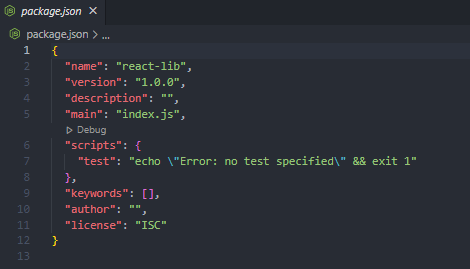
This initializes a node project in the current directory. The -y flag when passed to the NPM command tells the generator to use the defaults instead of asking questions, and a file package.json is created at the root of your directory
React & React DOM
Let's install react and react-dom as dev dependencies
npm i -D react react-dom
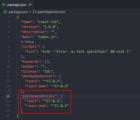
We are creating this library for reactJS so it is required that a project that uses this library must have react and react-dom as dependencies so let's add react and react-dom as peer dependencies in our package.json file.
Basic Folder Structure
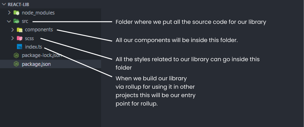
Before adding storybook and typescript and moving further let's create a basic folder structure for our project. You can have any folder structure that you prefer.
Installing Typescript
First, install typescript globally in your system with the following command
npm i typescript -g
Then install typescript and @types/react as a dev dependency in your project.
npm i -D typescript @types/react
Then create a tsconfig.json file using the following command.
tsc --init
This file will allow you to configure further and customize how Typescript and tsc compiler interact.
Open tsconfig.json and change the following configuration.
...
"compilerOptions" : {
    ...
    "jsx": "react",
    ...
    "module": "es6",
    ...
    "moduleResolution": "node",
    ....
    "outDir": "./dist",
    ....
  }
....
Getting Storybook
Storybook is an open-source tool for building UI components and pages in isolation. It streamlines UI development, testing, and documentation. It works with a javascript library such as React, Vue, Angular, etc.
To install the storybook in our library run this command:
npx sb init
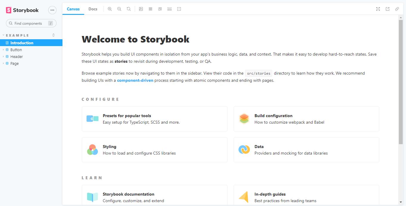
You should now be able to run Storybook locally by running npm run storybook or if you prefer yarn storybook.
Here is a preview of the Storybook application:
Making sense of the folder structure
npx sb init generates some files and folders let's take a look at them
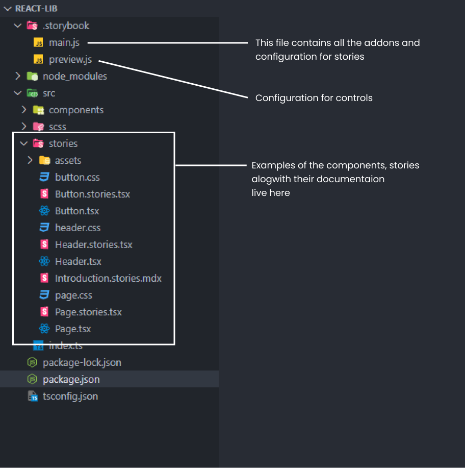
The stories folder
Storybook is smart enough and detects that the project uses Typescript and React so it creates some example components and documentation pages inside the stories folder in src. You can go ahead and remove everything from this folder but I recommend taking a peek inside to explore a little.
Introduction.stories.mdxcontains the documentation used to generate the Introduction page in the storybook preview above. Files with.mdxextension are written using MDX which is an amalgamation of JSX and Markdown. It helps to write component stories alongside their documentation at the same place.All files like
<ComponentName>.tsxare the react components created with typescript and files like<ComponentName>.stories.tsxis used to preview the stories in the storybook and helps us to develop component in isolation
The .storybook folder
Contains files for customizing Storybook:
main.jsdefines the file pattern used by Storybook to determine what to include in the showcase application. By default, Storybook uses files containing .stories in their name.
"stories": [
   "../src/**/*.stories.mdx",
   "../src/**/*.stories.@(js|jsx|ts|tsx)"
 ]
Addons for the Storybook application are also defined in main.js.
"addons": [
    "@storybook/addon-links",
    "@storybook/addon-essentials"
  ]
preview.jsconfigures how actions and controls will show up depending on the prop's name. By default, props such as onClick, onSubmit that start withonare automatically interpreted by Storybook as actions, so when triggered, they get logged inside Storybook's Actions addon. Besides, props suffixed with background and color will show a color picker control, whereas props suffixed with Date display a date picker control.
export const parameters = {
  actions: { argTypesRegex: "^on[A-Z].*" },
  controls: {
    matchers: {
      color: /(background|color)$/i,
      date: /Date$/,
    },
  },
}
The package.json file
npx sb init command adds all dev dependencies needed by the storybook and it also adds the following scripts in the package.json file
  "scripts": {
    "storybook": "start-storybook -p 6006",
    "build-storybook": "build-storybook"
  }
npm run storybookstarts a development server locally on your machinenpm build-storybookbuilds the static storybook application ready to be deployed
Adding SASS support
Storybook uses webpack to bundle all the code when we run storybook or build-storybook script.
By default, Storybook does not come with sass support. In order to add sass to our library, we need to add some packages and extend the webpack config in .stoybook/main.js
Add the following dev dependencies for adding sass support
npm i -D sass style-loader css-loader sass-loader@10.2.0
Let's understand these dependencies
sassis a pure JavaScript implementation of Sass.style-loaderinject CSS into the DOM.css-loaderinterprets @import and url() like import/require() and will resolve them.sass-loaderloads a Sass/SCSS file and compiles it to CSS. We are using a specific version because the latest version of sass-loader has a conflicting peer dependency issue with webpack that is used by the storybook internally.
To extend the webpack configuration lets add the following code in .storybook/main.js
const path = require("path");
.....
addons: ["@storybook/addon-links", "@storybook/addon-essentials"],
framework: "@storybook/react",
webpackFinal: async (config, { configType }) => {
    // Make whatever fine-grained changes you need
    config.module.rules.push({
      test: /\.scss$/,
      use: ["style-loader", "css-loader", "sass-loader"],
      include: path.resolve(__dirname, "../"),
    });

    // Return the altered config
    return config;
  }
....
With Sass support added, we are ready to build our components.
Creating our first component
Creating a button component
You can create any sort of component that you need to, but for the sake of this post let's create a Button component that can be reused.
Inside the components folder, create a file named Button.tsx .
First, we'll define the interface of the props that are required by the button.
We start by importing react inside our file and our button props extends the HTML button element as we might pass different props like onClick or type that are native to the HTML button element.
import React from "react";

export interface ButtonProps extends React.HTMLAttributes<HTMLButtonElement> {
  children: React.ReactNode;
  variant: "primary" | "danger";
  shape?: "rounded";
}
We are getting the following props
childrenthat will be rendered inside the button element.variant: the variant of button i.e.primaryordangerin this case.- we also have an optional
shapeprop.
Now Let's add our component
export const Button: React.FC<ButtonProps> = ({
  children,
  variant,
  shape,
  ...props
}) => {
  const classNames = `btn btn-${variant} btn-${shape}`;
  return (
    <button className={classNames} {...props}>
      {children}
    </button>
  );
};
Here we are returning an HTML button element from our function and we'll use the variant and shape prop to create different classNames and add them to our <button> element and we can target those particular classes from our SCSS to give different styles to our component.
For example, btn is the base class and when we pass a variant then we'll have a class either btn-primary or btn-danger depending on the variant passed, and we can add styling to different variants.
Adding styles for Button component
Create a global.scss file inside the scss folder. You can choose a folder structure of your choice and put SCSS code in different files and import them in this global.scss file, but for the sake of simplicity let's add all our styles in the global.scss file.
/* base styling for our button */
.btn {
  padding: 0.6rem 1rem;
  background: transparent;
  border: 1px solid #1e1e1e;
  cursor: pointer;
}

/* styling for our variants */
.btn-primary {
  border: none;
  background-color: blue;
  color: white;
  &:hover {
    background-color: blue;
  }
}
.btn-danger {
  border: none;
  background-color: red;
  color: white;
  &:hover {
    background-color: red;
  }
}

/* styling for different shape*/
.btn-rounded {
  border-radius: 0.4rem;
}
Either the button will have a btn-primary class or a btn-danger along with other classes and the respective styles will take effect.
Now we have created our button and added some styles let's use this button and see how it looks in our storybook.
Creating the Button story in storybook
Before creating a story for our button let's import our SCSS so that it can be used. Open the preview.js file inside the .storybook folder and import the global.scss file inside it.
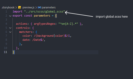
With our styles imported into the storybook let's create the Button Story.
Open the stories folder and delete all the files that were generated automatically by the storybook for us inside this folder and create a Button.stories.tsx file and write the following code
import React from "react";
import { Story } from "@storybook/react";
import { Button, ButtonProps } from "../components/Button";


export default {
  title: "Button",
  component: Button,
};

const Template: Story<ButtonProps> = args => <Button {...args} />;

export const Primary = Template.bind({});
Primary.args = {
  children: "Primary",
  variant: "primary",
};

export const Danger = Template.bind({});
Danger.args = {
  children: "Danger",
  variant: "danger",
  shape: "rounded",
};
Let's understand this code
We import our Button and ButtonProps from the Button.stories.tsx file and we start by exporting a default object that contains some metadata about this story like title and component. The title is the Actual Title of this story and inside the component, we have our Button component.
Then we create a Template function that takes some arguments and returns our button component.
const Template: Story<ButtonProps> = args => <Button {...args} />;
Now call Template.bind({}) for sort of creating a clone of our button template. This Template.bind({}) will return a function that we can store in a variable and export it. You can read more about .bind() here
export const Primary = Template.bind({});
Now set some args for our Primary button
Primary.args = {
  children: "Primary",
  variant: "primary",
};
Now run the npm run storybook command to start a development server and you'll see the button components
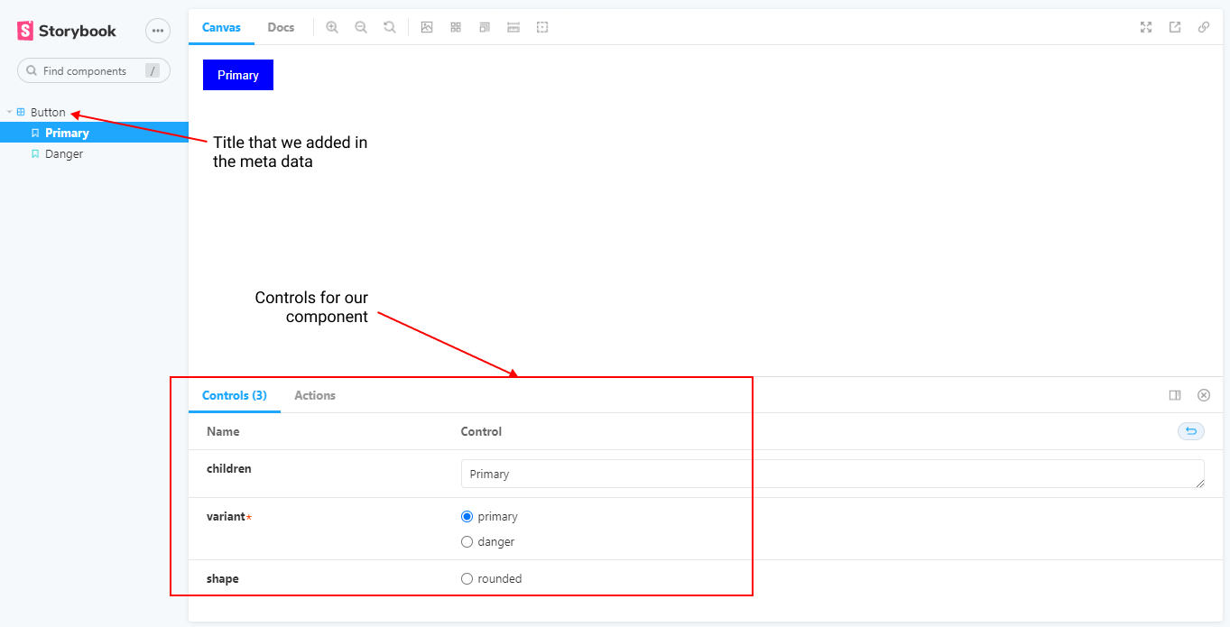
In the storybook's dev server, we have a control section that can be used to change props and see changes immediately or we can write more versions or variants of our button using Template.bind({}).
In this way, we can develop and test multiple components in isolation using the storybook.
Bundling using Rollup
Rollup is a good bundling tool, if we want to package the React component library and reuse it in other projects.
Rollup needs an entry point to generate the bundle. We have already created an index.ts file in the src folder which will serve as our entry point for Rollup.
Add the exports of the components in this index.ts file which will be used by others and also import the global.scss file here so we can create CSS bundle.
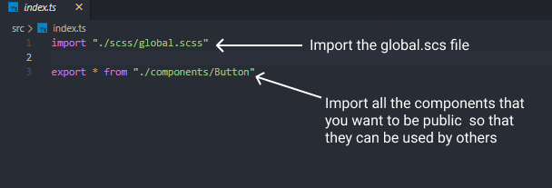
In order to build our library lets add the following dev dependencies.
npm i -D rollup @rollup/plugin-babel rollup-plugin-peer-deps-external rollup-plugin-scss rollup-plugin-terser @babel/preset-react @rollup/plugin-node-resolve @rollup/plugin-typescript
Let's understand these dependencies:
rollupgives the command-line interface (CLI) to bundle the library.@rollup/plugin-babelallows us seamless integration between Rollup and existing Babel.rollup-plugin-peer-deps-externalprevents adding peer dependencies to the bundle because the consumer of the library is expected to have them. So we also get a smaller bundle size.rollup-plugin-scssbundles scss files.rollup-plugin-terserminify generated es bundle.@babel/preset-reactadds support for JSX.@rollup/plugin-node-resolvehelps resolve third-party modules in case you are using any third-party dependencies. If you use any third-party dependency it is going to resolve them and add them to the source code.@rollup/plugin-typescripttranspiles TypeScript files to JavaScript.
Next, we create a rollup.config.js file and add the following contents.
import { babel } from "@rollup/plugin-babel";
import external from "rollup-plugin-peer-deps-external";
import resolve from "@rollup/plugin-node-resolve";
import scss from "rollup-plugin-scss";
import typescript from "@rollup/plugin-typescript";
import { terser } from "rollup-plugin-terser";

export default [
  {
    input: "./src/index.ts",
    output: [
      {
        file: "dist/index.js",
        format: "cjs",
      },
      {
        file: "dist/index.es.js",
        format: "es",
        exports: "named",
      },
    ],
    plugins: [
      scss({
        output: true,
        failOnError: true,
        outputStyle: "compressed",
      }),
      babel({
        exclude: "node_modules/**",
        presets: ["@babel/preset-react"],
      }),
      external(),
      resolve(),
      typescript(),
      terser(),
    ],
  },
];
Next, we need to update package.json. Libraries should be distributed using CommonJS and ES6. We specify the output file paths using main and module properties. We also use these properties in the Rollup configuration file.
Then we add a build script that uses rollup CLI with -c flag. This means that Rollup will look for a configuration file named rollup.config.js to bundle the component library.
...
 "main": "dist/index.js",
 "module": "dist/index.es.js",
...
"scripts": {
    ...
    "build": "rollup -c",
  }
...
Now if you run the npm run build command it will bundle our library and create a dist folder in the root of your project directory that could be deployed to npm.
Final Words
We have created a react component library from scratch using typescript. We installed the storybook for developing UI components in isolation and configured it to add SASS support and finally bundled everything together with Rollup.
I decided to write this article after I build a UI library for myself as a side project, if you are interested you can check it out here.
I hope you found this interesting and learned something. Thank you.
Per Aspera Ad Astra


